LNRadio
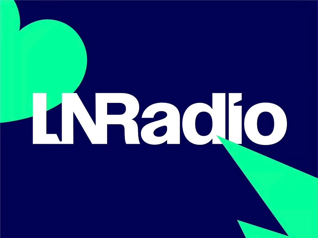
In an ultra-competitive environment, radio stations must stand out by creating a unique connection with their listeners, through a distinctive universe and vision. To make a strong impact, LNRadio decided to reinvent itself in 2025 with a brand-new visual identity.
The main goal of this rebranding ? To differentiate itself from its sister TV channel LN24 and establish LNRadio as a standalone brand, while keeping its original name. Naturally, this was a challenge we were eager to take on !
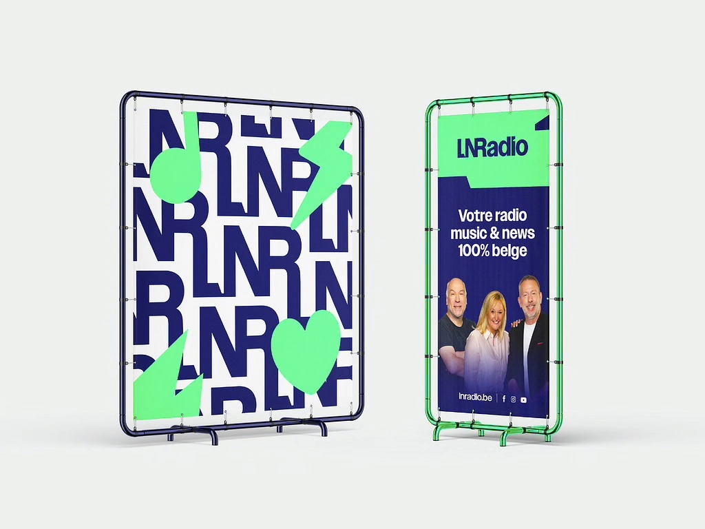
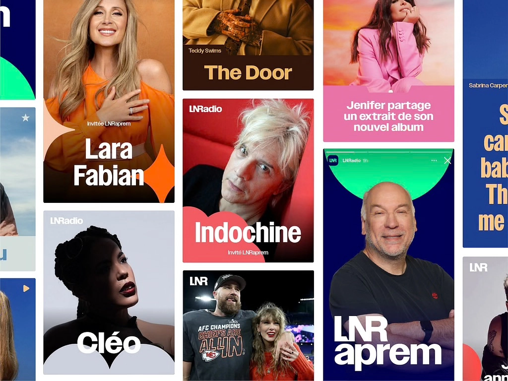
To meet these objectives, we chose a bolder, more daring visual universe that reflects the radio’s ambitions :
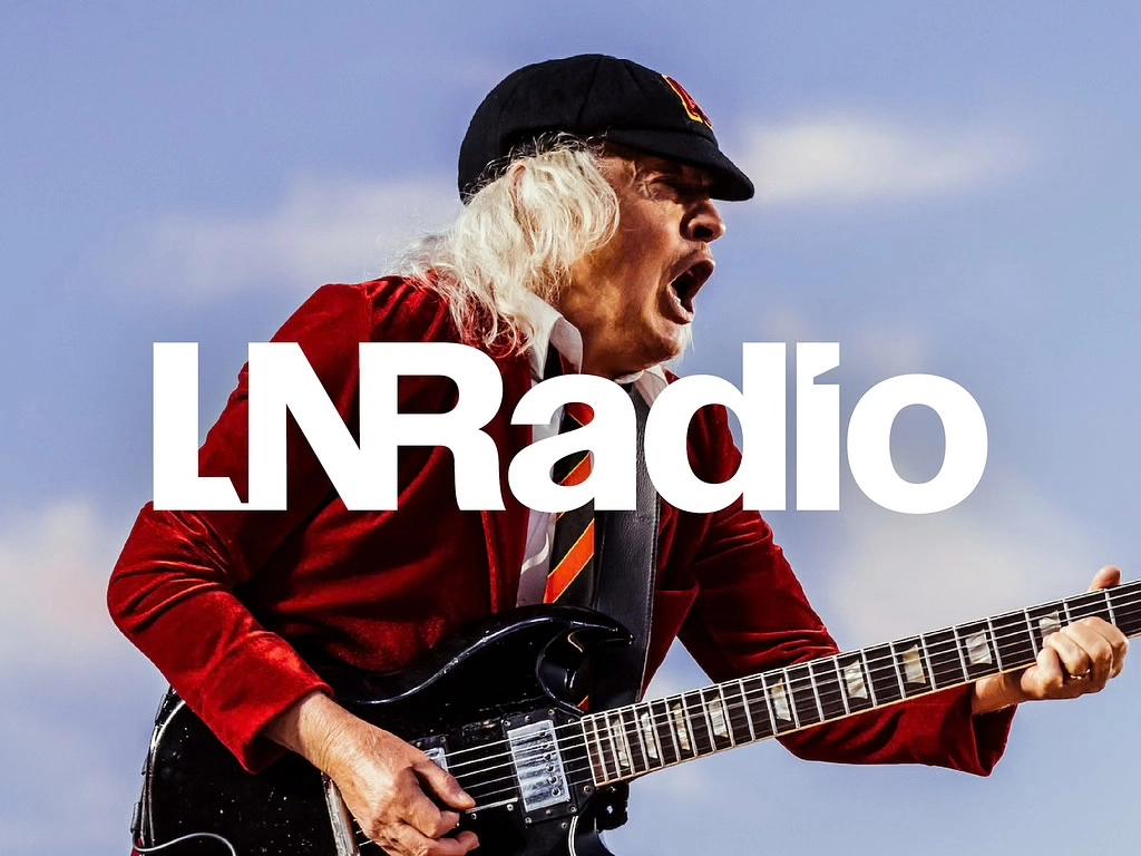
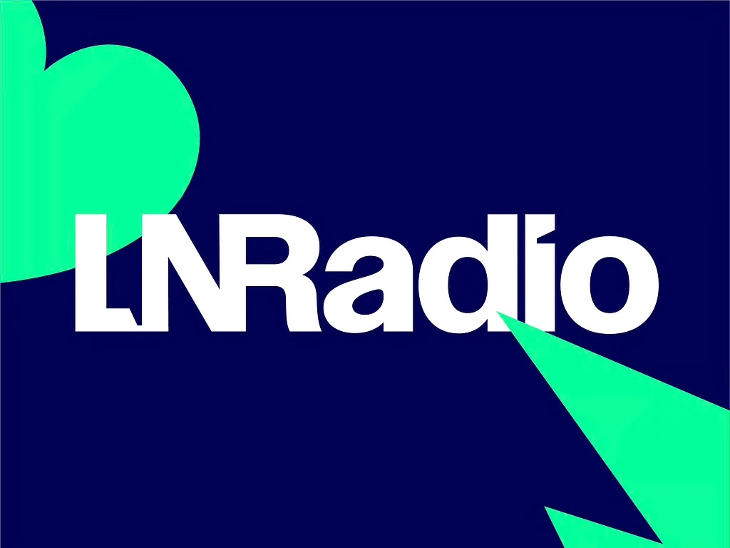
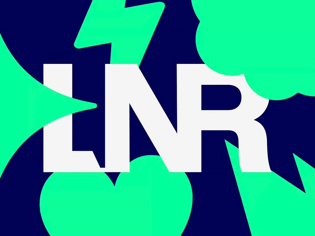
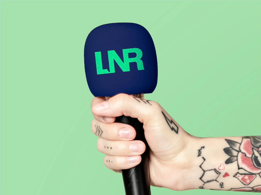
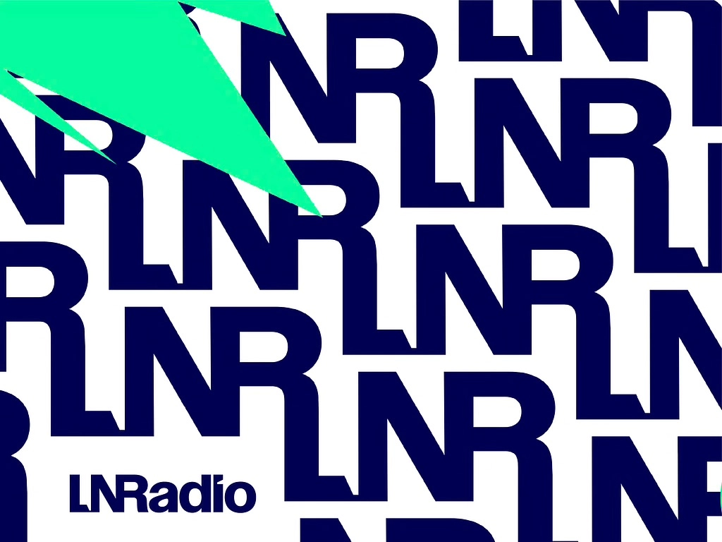
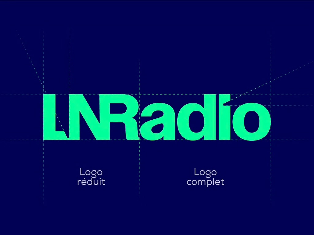
- The logo’s initials are merged, creating a new designation “LNRadio” alongside a shortened version, “LNR,” which helps distinguish it from the TV channel while preserving its original name.
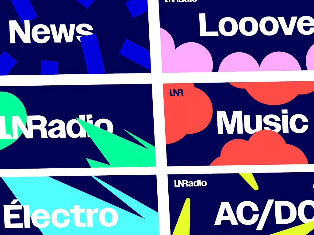
- The identity features a vibrant and contrasting color palette, perfect for digital platforms, combining a deep blue with a fresh and bright turquoise.
- The Owner font, highly versatile, allows the graphic message to be adapted across all formats and media.
- The icing on the cake : subtle details symbolizing the radio’s two core strengths — music and information — were designed. A turntable needle forms the dot of the “i” representing music, while a speech bubble between the “LN” symbolizes information.
This rebranding marks a new, more digital and dynamic era for the brand, bringing it closer and more connected to its audience.
Client
LNRadio
Sector
Media
Category
Start of the collaboration
January 2025